Modifiers and ViewExt
In this chapter, you will:
- Learn how modifier chaining works under the hood
- Use layout modifiers to control sizing, spacing, and alignment
- Apply visual effects like backgrounds, borders, shadows, and filters
- Add interactivity with tap, gesture, and drag-and-drop modifiers
- Understand why modifier order matters and how to get it right
You have your views and your reactive state. Now you need to make them look good and respond to user input. In WaterUI, you do this with modifiers – chainable methods that add styling, layout, and behavior to any view. Instead of passing dozens of parameters to a constructor, you build up the description one modifier at a time:
text!("Hello")
    .padding()
    .background(Color::blue())
    .on_tap(|| { /* ... */ })
This approach keeps your view constructors simple and your styling composable.
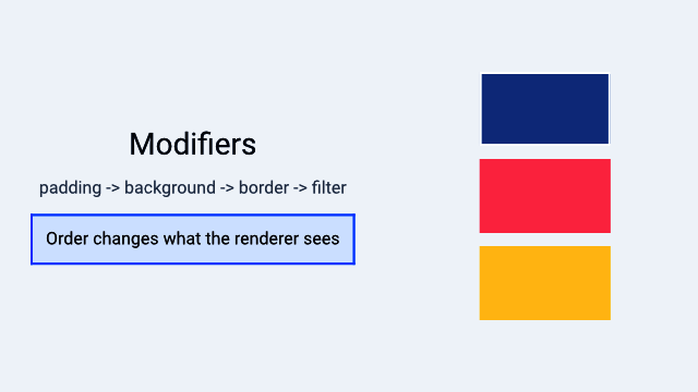
A Hydrolysis preview showing how modifier order changes rendered output. Example source.
How Modifiers Work
Every modifier method on ViewExt takes self (consuming the view) and returns a new type that wraps it. For example:
text!("Hello")          // Text
    .padding()          // Padding (wraps Text)
    .background(Color::blue())  // Background (wraps Padding)
    .border(Color::srgb(0, 0, 0), 1.0) // Metadata<Border> (wraps Background)
The resulting type is a nested structure. The renderer walks this structure from outside to inside, applying each modifier’s effect as it goes.
Because modifiers are type-level wrappers (not runtime property bags), the compiler can optimize aggressively and catch errors at compile time.
The ViewExt Trait
ViewExt is an extension trait automatically implemented for every View:
pub trait ViewExt: View + Sized {
    // ... modifier methods ...
}

impl<V: View + Sized> ViewExt for V {}
All methods are available through the WaterUI prelude – no special imports needed. The following sections catalog every modifier by category.
Layout Modifiers
Layout modifiers control sizing, spacing, and alignment – the fundamentals of placing your views on screen.
padding
Every UI needs breathing room. padding adds space around the view’s content:
// Default padding (14.0 points on all sides)
text!("Hello").padding()

// Custom edge insets
text!("Hello").padding_with(EdgeInsets::new(10.0, 20.0, 10.0, 20.0))

// EdgeInsets also supports From<f32> for uniform padding
text!("Hello").padding_with(16.0)
width, height, size
Fix the view to specific dimensions:
Color::red().width(100.0)
Color::red().height(50.0)
Color::red().size(100.0, 50.0) // both at once
min/max constraints
When you want a view that flexes within bounds:
text!("Flexible")
    .min_width(80.0)
    .max_width(300.0)
    .min_height(40.0)
    .max_height(200.0)

// Both axes at once
text!("Bounded").min_size(80.0, 40.0).max_size(300.0, 200.0)
alignment
Position the view within its allocated frame:
text!("Top Left").alignment(Alignment::TopLeading)
text!("Center").alignment(Alignment::Center)
text!("Bottom Right").alignment(Alignment::BottomTrailing)
ignore_safe_area
Extend the view’s bounds beyond safe area insets (useful for full-bleed backgrounds):
use waterui::prelude::*;

// Fill entire screen including notch/status bar area
Color::red().ignore_safe_area(EdgeSet::ALL)

// Only extend to top (under status bar)
header_view.ignore_safe_area(EdgeSet::TOP)
Frame Builder
The width, height, alignment, and constraint methods all return a Frame, which supports further chaining:
text!("Hello")
    .width(200.0)        // returns Frame
    .height(50.0)        // Frame method
    .min_width(100.0)    // Frame method
    .alignment(Alignment::Center) // Frame method
Tip: You can chain all frame-related modifiers together in one fluent call since they all return
Frame.
Visual Modifiers
Visual modifiers affect the appearance of views without changing their layout. These are what make your views look polished.
background
Render content behind the view:
// Solid color
text!("Hello").background(Color::red())

// Material (platform blur effect)
text!("Hello").background(Material::Regular)

// Any view as background
text!("Hello").background(
    hstack((Color::red(), Color::blue()))
)
The background fills the view’s bounds. The content determines the layout size; the background stretches to fill it.
foreground
Set the foreground color for text and icons in the subtree:
// All text in this VStack will be red
vstack((
    text!("Hello"),
    text!("World"),
)).foreground(Color::red())
This works by injecting a ForegroundOverride into the environment, so it affects all descendants that do not override it themselves.
opacity
Control transparency. Any IntoSignalF32 is accepted, including a constant f32 or a reactive Binding<f32>:
// Static opacity
text!("Faded").opacity(0.5)

// Reactive opacity (useful for animations)
let alpha = Binding::f32(1.0);
text!("Dynamic").opacity(alpha)
The opacity modifier maps to compositor-native operations (no GPU pass) and is available directly on ViewExt.
overlay
Render content on top of the view, without affecting the base view’s size:
text!("Hello").overlay(
    Color::red().opacity(0.5)
)
Unlike ZStack, an overlay does not influence the layout of the underlying view.
Tip:
overlayis great for badges, status indicators, or decorative elements that should sit on top of content without affecting layout.
shadow
Add a drop shadow. Shadow::new takes a color, an offset vector, and a blur radius:
use waterui::style::{Shadow, Vector};

text!("Shadowed").shadow(Shadow::new(
    Color::srgb(0, 0, 0).with_opacity(0.3),
    Vector { x: 2.0, y: 2.0 },
    4.0,
))
border
Add a border around the view:
// Simple border on all edges
text!("Bordered").border(Color::red(), 2.0)

// Full customization via Border builder
let custom = Border::new(Color::blue(), 2.0)
    .corner_radius(12.0)
    .edges(EdgeSet::HORIZONTAL);

text!("Custom").border_with(custom)
clip
Clip the view to a shape. The shape is normalized to the view’s bounds, so RoundedRectangle::new accepts a corner radius in 0.0..=0.5:
use waterui::shape::{Circle, RoundedRectangle};

// Clip to circle
avatar_view.clip(Circle)

// Clip to rounded rectangle (10% corner radius)
card_view.clip(RoundedRectangle::new(0.1))
visible
Control visibility. visible is implemented as a composition of opacity and hit testing – when hidden, the view fades to opacity 0.0 and stops receiving touches:
let show = Binding::bool(true);
text!("Now you see me").visible(show)
Transform Modifiers
Transforms are purely visual – they change how the view is drawn but do not affect layout calculations. This makes them ideal for animations.
scale
Scale the view around its center. Both axes accept any IntoSignalF32:
// Uniform scale
star_view.scale(1.5, 1.5)

// Non-uniform scale
text!("Stretched").scale(2.0, 1.0)

// Reactive (for animations)
let s = Binding::f32(1.0);
heart_view.scale(s.clone(), s)

// Scale from a specific anchor point
star_view.scale_from(0.5, 0.5, Anchor::TOP_LEFT)
rotation
Rotate the view in degrees:
// Static (positive = clockwise)
arrow_view.rotation(45.0)

// Reactive
let angle = Binding::f32(0.0);
spinner_view.rotation(angle)

// Rotate around a specific anchor
dial_view.rotation_from(90.0, Anchor::TOP_LEFT)
offset
Translate the view:
// Static offset
badge.offset(10.0, -5.0)

// Reactive (great for drag or animation)
let x = Binding::f32(0.0);
let y = Binding::f32(0.0);
draggable_view.offset(x, y)
Tip: Combine
offsetwith reactive bindings and animations to create smooth drag interactions or slide-in effects.
Interaction Modifiers
These modifiers add gesture recognition and touch handling to views. They turn passive content into interactive controls.
on_tap
The simplest interaction – recognize a single tap:
text!("Click me").on_tap(|| {
    tracing::info!("Tapped!");
})
on_tap_gesture_count
Require a specific number of taps:
text!("Double-tap me").on_tap_gesture_count(2, || {
    tracing::info!("Double tapped!");
})
on_long_press_gesture
Recognize a long press:
text!("Press and hold").on_long_press_gesture(500, || {
    tracing::info!("Long pressed for 500ms!");
})
gesture
Attach any gesture recognizer:
use waterui::gesture::*;

text!("Custom gesture")
    .gesture(TapGesture::repeat(3), || {
        tracing::info!("Triple tap!");
    })
hittable
Control whether the view responds to touch/click events:
// Disable hit testing -- touches pass through
overlay_decoration.hittable(false)

// Reactive control
let interactive = Binding::bool(true);
my_view.hittable(interactive)
disabled
Disable the view – grays it out and blocks all interactions:
// Static
button("Submit").action(|| {}).disabled(true)

// Reactive
let is_loading = Binding::bool(false);
button("Submit").action(|| {}).disabled(is_loading)
disabled is a convenience that composes opacity(0.5), hittable(false), and the corresponding accessibility state.
draggable
Make a view draggable:
use waterui::drag_drop::DragData;

text!("Drag me").draggable(DragData::text("Hello!"))
drop_destination
Make a view accept dropped content:
text!("Drop here").drop_destination(|data: DragData| {
    tracing::info!("Received: {:?}", data);
})
Stateful Event Handlers
Sometimes your event handlers need to capture mutable state – for example, tracking a hover count or toggling a flag. Use ViewExt::state to inject cloneable state into the view’s environment, then extract it in handlers via the State<T> extractor:
use waterui::extract::State;

let count = Binding::i32(0);
let is_hovered = Binding::bool(false);

text("Hover Me!")
    .padding()
    .state(&count)
    .state(&is_hovered)
    .on_hover_enter(
        |State(count): State<Binding<i32>>,
         State(hovered): State<Binding<bool>>| {
            count.set(count.get() + 1);
            hovered.set(true);
        },
    )
    .on_hover_exit(|State(hovered): State<Binding<bool>>| {
        hovered.set(false);
    })
Each .state(&value) call inserts that binding into the subtree’s environment. Handlers extract whichever values they need via State<T> parameters; missing values become a clear runtime error.
Feedback Modifiers
These modifiers provide sensory feedback to the user, making your app feel more responsive and native.
on_tap_haptic
Trigger haptic feedback on tap (requires the std feature):
use waterkit_haptic::Intensity;

text!("Haptic tap").on_tap_haptic(Intensity::MEDIUM, || {
    // action
})

// Default medium intensity
text!("Haptic tap").on_tap_haptic_default(|| {
    // action
})
cursor
Set the cursor style when hovering (desktop platforms):
use waterui::cursor::CursorStyle;

text!("Click me").cursor(CursorStyle::PointingHand)
badge
Add a numeric badge overlay (common for notification counts):
let unread = Binding::i32(5);
SystemIcon::new("envelope").badge(unread)
Filter Modifiers
Filter modifiers apply GPU-accelerated visual effects. They come from the FilterViewExt trait (included in the prelude) and are great for image processing and polished UI effects.
blur
Apply a Gaussian blur:
photo_view.blur(10.0)

// Reactive
let blur_amount = Binding::f32(0.0);
photo_view.blur(blur_amount)
brightness
Adjust brightness:
photo_view.brightness(0.2)  // increase
photo_view.brightness(-0.2) // decrease
contrast
Adjust contrast:
photo_view.contrast(1.5) // higher contrast
photo_view.contrast(0.5) // lower contrast
saturation
Adjust color saturation:
photo_view.saturation(1.5) // more vivid
photo_view.saturation(0.0) // completely desaturated
grayscale
Convert to grayscale:
photo_view.grayscale(1.0) // fully grayscale
photo_view.grayscale(0.5) // partially desaturated
hue_rotation
Rotate the hue of all colors (degrees):
photo_view.hue_rotation(90.0)  // shift by 90 degrees
photo_view.hue_rotation(180.0) // invert hues
All filter modifiers accept any impl IntoSignalF32, which means you can pass a static f32, a Binding<f32>, or any signal-based value for animated filters.
Tip: Try animating
blurorsaturationwith a reactive binding for smooth transition effects – for example, blurring the background when a modal appears.
Lifecycle Modifiers
These modifiers let you run code at specific points in a view’s lifecycle.
on_appear
Execute code when the view becomes visible:
text!("Hello").on_appear(|| {
    tracing::info!("View is now visible");
})
Note:
body()being called does not mean the view is visible. A lazy container may resolve views ahead of time. Useon_appearfor code that should run when the view is actually displayed on screen.
on_disappear
Execute code when the view is removed from the view hierarchy:
text!("Hello").on_disappear(|| {
    tracing::info!("View removed from hierarchy");
})
on_change
Monitor a signal and execute a handler when the value changes:
let search = Binding::container(String::new());

text_field("Search", search.clone())
    .on_change(&search, |value: String| {
        tracing::info!("Search changed to: {value}");
    })
This is a convenience over manual watch() + retain() – the watcher lifecycle is managed automatically. The handler receives the new Output value of the source signal.
task
Spawn an async task tied to the view’s lifecycle:
text!("Loading...").task(async {
    let data = fetch_data().await;
    // The task is cancelled when the view is removed
})
Event Modifiers
on_hover_enter / on_hover_exit
React to cursor hover (macOS, iPadOS with trackpad, Android API 24+):
text!("Hover me")
    .on_hover_enter(|| tracing::info!("Mouse entered"))
    .on_hover_exit(|| tracing::info!("Mouse exited"))
event
Attach a handler for any Event variant:
use waterui_core::event::Event;

text!("Interactive")
    .event(Event::HoverEnter, || { /* ... */ })
    .event(Event::HoverExit, || { /* ... */ })
Other Modifiers
metadata
Attach arbitrary metadata to a view:
text!("Important").metadata(MyCustomMetadata { priority: 1 })tag
Tag a view for identification:
text!("Item").tag(42)anyview
Convert to a type-erased AnyView:
let view: AnyView = text!("Hello").anyview();retain
Keep a value alive for the view’s lifetime:
let guard = some_signal.watch(|_| { /* ... */ });
text!("Watching").retain(guard)
title
Wrap in a navigation view with a title:
content_view.title(text!("Settings"))focused
Mark the view as focused when a binding matches:
let focus = Binding::container::<Option<Field>>(None);
text_field("Name", name).focused(&focus, Field::Name)
secure
Prevent screenshots of the view:
sensitive_content.secure()context_menu
Attach a context menu (long-press on mobile, right-click on desktop). Menu content is built from MenuView implementations – ordinary Buttons with .action() work directly:
text("Right-click me").context_menu((
    button("Copy").action(|| { /* ... */ }),
    button("Paste").action(|| { /* ... */ }),
))
a11y_label / a11y_role
Set accessibility attributes:
SystemIcon::new("star").a11y_label("Favorite")
SystemIcon::new("star").a11y_role(AccessibilityRole::Button)
Tip: Always add
a11y_labelto icon-only buttons and interactive elements. Screen readers rely on these labels to describe your UI to users with visual impairments.
Modifier Order
Modifier order matters in WaterUI because each modifier wraps the previous result. The outermost modifier is applied first during rendering. Getting the order wrong is one of the most common sources of “why does my layout look wrong?”
A common pattern where order matters:
// Padding INSIDE the background
text!("Hello")
    .padding()           // padding applied first
    .background(Color::red()) // background wraps the padded view

// Padding OUTSIDE the background
text!("Hello")
    .background(Color::red()) // background applied first
    .padding()           // padding wraps the background
Similarly for transforms:
// Rotate then offset -- rotates in place, then translates
view.rotation(45.0).offset(100.0, 0.0)

// Offset then rotate -- translates first, then rotates around original center
view.offset(100.0, 0.0).rotation(45.0)
Warning: If your background does not seem to extend behind your padding, or your border appears inside your content area, check your modifier order.
General guidelines:
- Layout modifiers (padding, frame, alignment) should go before visual modifiers.
- Gestures should go after layout/visual modifiers so the hit area matches what the user sees.
- Lifecycle hooks can go anywhere – they do not affect rendering.
- Background goes after padding if you want the background to include the padded area.
Try swapping .padding() and .background() on a view and observe the difference.
Complete Example
Here is a complete example that puts many modifier categories together:
use waterui::prelude::*;
use waterui::shape::RoundedRectangle;
use waterui::style::{Shadow, Vector};

fn card(title: &'static str, count: Binding<i32>) -> impl View {
    let is_highlighted = count.clone().map(|n| n > 10);
    let background = is_highlighted.map(|on| {
        if on { Color::blue() } else { Color::grey() }
    });

    vstack((
        text(title).foreground(Color::srgb(255, 255, 255)),
        text!("{count}"),
        button("Increment").action(move || {
            count.set(count.get() + 1);
        }),
    ))
    .padding()
    .background(background)
    .border(Color::srgb(0, 0, 0), 1.0)
    .clip(RoundedRectangle::new(0.15))
    .shadow(Shadow::new(
        Color::srgb(0, 0, 0).with_opacity(0.2),
        Vector { x: 0.0, y: 2.0 },
        4.0,
    ))
    .on_appear(|| tracing::info!("Card appeared"))
}
Summary
| Category | Modifiers |
|---|---|
| Layout | padding, padding_with, width, height, size, min_width, max_width, min_height, max_height, min_size, max_size, alignment, ignore_safe_area |
| Visual | background, foreground, overlay, shadow, border, border_with, clip, visible |
| Transform | scale, scale_from, rotation, rotation_from, offset |
| Interaction | on_tap, on_tap_gesture, on_tap_gesture_count, on_long_press_gesture, gesture, gesture_observer, hittable, disabled, draggable, drop_destination, state |
| Feedback | on_tap_haptic, on_tap_haptic_default, cursor, badge |
| Filter | blur, brightness, contrast, saturation, grayscale, hue_rotation, opacity |
| Lifecycle | on_appear, on_disappear, on_change, task |
| Event | event, on_hover_enter, on_hover_exit |
| Other | metadata, tag, anyview, retain, title, focused, secure, context_menu, a11y_label, a11y_role, with, install |
You now have the complete toolkit for building views, managing reactive state, sharing configuration through the environment, and styling everything with modifiers. The next part of the book, Building UIs, puts all of these concepts together as you work with text, layouts, controls, forms, and navigation.