Layout: stacks, frames, and grids
In this chapter, you will:
- Arrange views vertically, horizontally, and in layers using stacks
- Control spacing, alignment, and sizing with frames and padding
- Build grid-based layouts and scrollable content
- Use absolute positioning and pin constraints for free-form layouts
Every app needs to place things on screen — a title at the top, a button at the bottom, a sidebar on the left. WaterUI uses a declarative layout system inspired by SwiftUI: you compose views using stacks, spacers, frames, and grids, and the framework resolves sizes and positions through a proposal-based layout protocol. All values are in logical pixels (points/dp) — the same unit as Figma and Sketch. Native backends convert to physical pixels automatically.
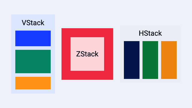
A Hydrolysis preview of WaterUI stack layout primitives. Example source.
Stacks
Stacks are your primary tool for arranging views. Think of them as the rows and columns of your interface. WaterUI provides three kinds: vstack (vertical), hstack (horizontal), and zstack (overlay).
vstack — vertical layout
vstack arranges children from top to bottom. It accepts a tuple of views:
use waterui::prelude::*;

fn profile_card() -> impl View {
    vstack((
        text("Alice").title(),
        text("Software Engineer"),
        text("San Francisco"),
    ))
}
Default spacing between children is 10pt and alignment is center.
Custom spacing and alignment
Use the struct constructor for full control:
use waterui::prelude::*;

fn left_aligned() -> impl View {
    VStack::new(HorizontalAlignment::Leading, 16.0, (
        text("Left-aligned"),
        text("Also left-aligned"),
    ))
}
Or chain the builder methods on vstack:
use waterui::prelude::*;

fn trailing_8pt() -> impl View {
    vstack((
        text("Item 1"),
        text("Item 2"),
    ))
    .alignment(HorizontalAlignment::Trailing)
    .spacing(8.0)
}
Horizontal alignment options
pub enum HorizontalAlignment {
    Leading,  // left in LTR locales
    Center,   // default
    Trailing, // right in LTR locales
}
hstack — horizontal layout
hstack arranges children left to right. This is what you reach for when building toolbars, rows of buttons, or any side-by-side arrangement:
use waterui::prelude::*;

fn toolbar() -> impl View {
    hstack((
        text("WaterUI"),
        spacer(),
        button("Settings").action(|| {}),
    ))
}
Default spacing is 10pt and alignment is center (vertical).
Custom spacing and alignment
use waterui::prelude::*;

fn top_aligned() -> impl View {
    HStack::new(VerticalAlignment::Top, 20.0, (
        text("Top-aligned"),
        text("Also top"),
    ))
}
Vertical alignment options
pub enum VerticalAlignment {
    Top,
    Center,  // default
    Bottom,
    FirstBaseline,
    LastBaseline,
}
zstack — overlay layout
When you need to layer views on top of each other — a badge on an avatar, text over an image — reach for zstack. The last child in the tuple renders on top, and the stack sizes itself to fit the largest child:
use waterui::prelude::*;

fn badge() -> impl View {
    zstack((
        Blue,
        text("Overlay").color(Yellow),
    ))
}
zstack alignment
Control where children are positioned within the stack:
use waterui::prelude::*;

fn corner_badge(image: impl View, dot: impl View) -> impl View {
    ZStack::new(Alignment::TopTrailing, (image, dot))
}
The Alignment enum has nine positions:
pub enum Alignment {
    TopLeading, Top, TopTrailing,
    Leading, Center, Trailing,    // Center is the default
    BottomLeading, Bottom, BottomTrailing,
}
Spacer
Spacer is a flexible gap that expands to push views apart. It adapts to its parent container: in an HStack it expands horizontally, in a VStack it expands vertically. This is one of the most useful layout tools you have.
use waterui::prelude::*;

fn pushed_to_the_edge() -> impl View {
    hstack((
        text("Title"),
        spacer(),
        button("Done").action(|| {}),
    ))
}
Minimum length
Use spacer_min to set a minimum length the spacer never shrinks below:
use waterui::prelude::*;

fn at_least_20pt() -> impl View {
    hstack((text("A"), spacer_min(20.0), text("B")))
}
Divider
The Divider widget draws a thin line for visual separation between sections:
use waterui::prelude::*;

fn sectioned() -> impl View {
    vstack((
        text("Section 1"),
        Divider,
        text("Section 2"),
    ))
}
Padding
Add breathing room around a view with the Padding wrapper, or its ViewExt shortcuts. padding() applies a default 14pt inset; use padding_with(EdgeInsets) for exact control:
use waterui::prelude::*;

fn padded() -> impl View {
    vstack((
        // Default 14pt on every side.
        text("Default").padding(),

        // Equal padding on all sides.
        text("Padded").padding_with(EdgeInsets::all(16.0)),

        // Symmetric vertical and horizontal.
        text("Symmetric").padding_with(EdgeInsets::symmetric(8.0, 16.0)),

        // Explicit edges.
        text("Custom").padding_with(EdgeInsets::new(10.0, 20.0, 15.0, 25.0)),
    ))
}
EdgeInsets provides three constructors. Note the explicit-edge order:
| Constructor | Description |
|---|---|
EdgeInsets::all(v) | Equal inset on every edge |
EdgeInsets::symmetric(vertical, horiz) | Vertical and horizontal insets |
EdgeInsets::new(top, bottom, leading, trailing) | Explicit edges |
Frame
When you need a view to be a specific size, or at least a minimum width, wrap it in Frame. It supports minimum, ideal, and maximum dimensions:
use waterui::prelude::*;
use waterui::layout::frame::Frame;

fn fixed() -> impl View {
    Frame::new(text("Fixed"))
        .width(200.0)
        .height(100.0)
}

fn bounded() -> impl View {
    Frame::new(text("Bounded"))
        .max_width(300.0)
        .max_height(200.0)
}
Frame alignment
Control how the child is positioned within the frame:
use waterui::prelude::*;
use waterui::layout::frame::Frame;

fn bottom_right() -> impl View {
    Frame::new(text("Bottom-right"))
        .width(300.0)
        .height(200.0)
        .alignment(Alignment::BottomTrailing)
}
Frame methods
| Method | Description |
|---|---|
.width(f32) | Set the ideal width |
.height(f32) | Set the ideal height |
.min_width(f32) | Set the minimum width |
.max_width(f32) | Set the maximum width |
.min_height(f32) | Set the minimum height |
.max_height(f32) | Set the maximum height |
.alignment(a) | Align the child in frame |
Tip: Use
Frameonly when you need explicit size constraints. Most views have sensible natural sizes, and stacks distribute space for you.
Scrolling
When content might exceed the available space, wrap it in a scroll view. This is essential for long lists and tall forms:
use waterui::prelude::*;

fn long_list() -> impl View {
    scroll(
        vstack((
            text("Item 1"),
            text("Item 2"),
            text("Item 3"),
        )),
    )
}
Three convenience constructors map to ScrollView:
| Function | Direction |
|---|---|
scroll(content) | Vertical only |
scroll_horizontal(c) | Horizontal only |
scroll_both(c) | Both directions |
Grid
For content that naturally falls into rows and columns — a settings panel with labels and values, or an image gallery — use Grid. You specify the number of columns, and the grid distributes children into rows automatically:
use waterui::prelude::*;

fn settings_grid() -> impl View {
    grid(2, [
        row((text("Name"), text("Alice"))),
        row((text("Age"), text("30"))),
        row((text("City"), text("SF"))),
    ])
}
Grid customisation
use waterui::prelude::*;
use waterui::layout::grid::{Grid, GridRow};

fn three_col(rows: Vec<GridRow>) -> impl View {
    Grid::new(3, rows)
        .spacing(16.0)
        .alignment(Alignment::Leading)
}
Default spacing is 8pt in both directions, and default alignment is Center. The grid sizes columns equally based on the available width; row heights are determined by the tallest item in each row.
Overlay
An Overlay layers content on top of a base view without changing the base’s layout sizing. Use it for badges, highlights, and decorations:
use waterui::prelude::*;

fn avatar_with_badge(avatar: impl View, dot: impl View) -> impl View {
    overlay(avatar, dot).alignment(Alignment::TopTrailing)
}
Unlike zstack, the overlay’s size is determined entirely by the base child. The overlay content is positioned within those bounds according to the alignment.
Note: If you need both children to contribute to the overall size, use
zstackinstead.Overlayis for decorations that should not affect layout.
Background
background() renders a view behind another view. The content child determines the size, and the background fills those bounds:
use waterui::prelude::*;

fn highlighted() -> impl View {
    background(text("Foreground content"), Blue)
}
Absolute positioning
For the rare cases where stacks and grids are not enough — floating action buttons, custom popovers, canvas-like UIs — use absolute with the PositionExt extensions:
use waterui::prelude::*;

fn floating_ui(fab: impl View) -> impl View {
    absolute((
        Color::grey(),
        text("Center").position_in(UnitPoint::CENTER),
        fab.position_in_offset(
            UnitPoint::BOTTOM_TRAILING,
            UnitPoint::BOTTOM_TRAILING,
            -16.0,
            -16.0,
        ),
    ))
}
Positioning methods
The PositionExt trait provides these methods on any View:
| Method | Description |
|---|---|
.position(x, y) | Center at absolute coordinates |
.position_anchor(anchor, x, y) | Anchor point at absolute coordinates |
.position_in(unit) | Center at fractional parent position |
.position_in_anchor(anchor, pos) | Anchor at fractional parent position |
.position_in_offset(anchor, pos, dx, dy) | Fractional position plus offset |
.pin(constraints) | Edge-based pinning |
UnitPoint constants
UnitPoint uses normalised coordinates (0.0 to 1.0):
UnitPoint::TOP_LEADING     // (0.0, 0.0)
UnitPoint::TOP             // (0.5, 0.0)
UnitPoint::TOP_TRAILING    // (1.0, 0.0)
UnitPoint::LEADING         // (0.0, 0.5)
UnitPoint::CENTER          // (0.5, 0.5)
UnitPoint::TRAILING        // (1.0, 0.5)
UnitPoint::BOTTOM_LEADING  // (0.0, 1.0)
UnitPoint::BOTTOM          // (0.5, 1.0)
UnitPoint::BOTTOM_TRAILING // (1.0, 1.0)
Pin constraints
Pin-based positioning uses edge distances to compute position and size. This is useful when you want a child to stretch between edges or sit at a fixed offset from a corner:
use waterui::prelude::*;
use waterui::layout::PinConstraints;

fn fill_with_inset(child: impl View) -> impl View {
    child.pin(PinConstraints::all(12.0))
}

fn corner_badge(badge: impl View) -> impl View {
    badge.pin(
        PinConstraints::new()
            .trailing(12.0)
            .bottom(12.0)
            .width(28.0)
            .height(28.0),
    )
}
When both leading and trailing are set, the width is computed automatically. The same applies to top and bottom. Explicit .width() and .height() override the computed dimensions.
StretchAxis
Every view has an associated StretchAxis that tells parent layouts whether it wants to expand along one or both axes. Understanding this concept helps you predict how views behave inside stacks:
pub enum StretchAxis {
    None,       // content-sized (e.g. Text, Button)
    Horizontal, // expands width (e.g. TextField, Slider, VStack)
    Vertical,   // expands height
    Both,       // fills available space (e.g. ScrollView, Absolute)
    MainAxis,   // expands along parent stack's main axis (Spacer)
    CrossAxis,  // expands along parent stack's cross axis
}
Stacks use this information to distribute surplus space. For example, Spacer reports MainAxis, so in an HStack it expands horizontally and in a VStack it expands vertically. A TextField reports Horizontal, so it fills available width but keeps its intrinsic height.
Tip: If a view is not expanding as you expect, check its stretch axis. A
Textview never stretches; aTextFieldstretches horizontally; aScrollViewstretches in both directions.
Dynamic stacks via for_each
Stacks support dynamic children through for_each. Instead of a fixed tuple, you provide a reactive collection and a generator that returns one view per element:
use waterui::prelude::*;
use waterui::reactive::collection::List as ReactiveList;

#[derive(Clone)]
struct TodoItem { id: i32, title: String }

impl Identifiable for TodoItem {
    type Id = i32;
    fn id(&self) -> i32 { self.id }
}

fn todo_list(items: ReactiveList<TodoItem>) -> impl View {
    VStack::for_each(items, |item| text(item.title))
        .spacing(8.0)
        .alignment(HorizontalAlignment::Leading)
}
This integrates with the LazyContainer system for efficient rendering of large collections. See the Lists and collections chapter for the full story.
Layout tips
- Start with stacks. Most layouts can be expressed as nested
vstackandhstackcalls. Usespacer()to distribute remaining space. - Use
Frameonly when needed. Text and controls have natural sizes; apply explicit frames only for fixed-size regions or constraints. - Prefer
Alignmentover manual positioning. Stack alignment handles most needs. Reserveabsolutefor truly free-form layouts. - Logical pixels everywhere. Backends handle screen density for you.
- Inspect
StretchAxiswhen something refuses to fit. It tells you whether a view will fight for or yield space.
With layout under your belt, you are ready to make your interfaces interactive. In the next chapter, you will learn about buttons, toggles, sliders, and other controls that let users take action.