Forms and data entry
In this chapter, you will:
- Generate a complete form UI from a Rust struct with
#[derive(FormBuilder)]- Understand how Rust types map to UI controls automatically
- Use pickers, date pickers, color pickers, and secure fields
- Validate user input with composable validators
- Build a registration form from scratch
Every app that collects user data needs forms — registration screens, settings panels, profile editors. Building these by hand means wiring up a text field for each string, a toggle for each boolean, a stepper for each number. WaterUI’s form system solves this by generating UI controls from your Rust data structures. Derive a single trait, and your struct becomes an editable form.
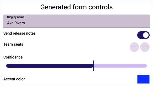
A Hydrolysis preview of stable WaterUI data-entry controls used by forms. Example source.
The FormBuilder trait
The FormBuilder trait is the foundation of the form system. It maps a type to a view that can edit a Binding of that type:
pub trait FormBuilder: Sized {
    type View: View;

    fn view<L: IntoLabel>(
        binding: &Binding<Self>,
        label: L,
        placeholder: Str,
    ) -> Self::View;

    fn binding() -> Binding<Self>
    where
        Self: Default + Clone,
    {
        Binding::default()
    }
}
You can implement this trait manually for full control, but in most cases the derive macro does the work for you.
The derive macro
Annotate your struct with #[derive(FormBuilder)], and each field generates an appropriate control:
use waterui::prelude::*;

#[derive(Default, Clone, Debug, FormBuilder, Project)]
pub struct UserProfile {
    /// Display name
    pub name: String,
    /// Account active status
    pub active: bool,
    /// User's current level
    pub level: i32,
}
That is it — three lines of fields, and WaterUI knows how to render a text field, a toggle, and a stepper. The derive macro relies on the Project derive to expose per-field bindings; you can either derive both or use the #[form] attribute, which derives Default, Clone, Debug, FormBuilder, and Project in one step.
Rendering a form
Use the form() function to create a view from a binding:
use waterui::prelude::*;

#[derive(Default, Clone, Debug, FormBuilder, Project)] struct UserProfile { name: String }
fn profile_editor() -> impl View {
    let profile = UserProfile::binding();
    form(&profile)
}
Pre-fill with initial data by constructing the binding directly:
use waterui::prelude::*;

#[derive(Default, Clone, Debug, FormBuilder, Project)] struct UserProfile { name: String }
fn edit_profile(initial: UserProfile) -> impl View {
    let profile = Binding::container(initial);
    form(&profile)
}
Tip: Try it yourself — define a struct with a mix of
String,bool, andi32fields, derive the form, and watch the controls appear.
Type-to-component mapping
The derive macro maps Rust types to controls automatically:
| Rust type | UI component | Notes |
|---|---|---|
String | TextField | Doc comment becomes placeholder |
Str | TextField | WaterUI’s interned string type |
bool | Toggle | Switch-style control |
i32 (and other integers) | Stepper | With +/- buttons |
f64 / f32 | Slider | Range 0.0..=1.0 by default |
Color | ColorPicker | Platform-native color selector |
Field labels and placeholders
The derive macro converts each field name from snake_case to a "Title Case" label. A doc comment on the field becomes the placeholder argument passed to FormBuilder::view:
use waterui::prelude::*;

#[form]
pub struct ContactForm {
    /// Enter your email address
    pub email: String,
}
For a String field, that doc comment surfaces as the TextField’s prompt.
Numeric fields
i32(and other integer widths) maps to aStepperwith the fulli32::MIN..=i32::MAXrange.f64andf32map to aSliderwith range0.0..=1.0.
If you need different ranges or formatting, use a manual implementation (below).
Color fields
Color fields produce a ColorPicker with platform-native UI:
use waterui::prelude::*;

#[form]
pub struct ThemeConfig {
    pub accent_color: Color,
}
Manual form implementation
For custom layouts or fields outside the automatic mapping, implement FormBuilder yourself:
use waterui::prelude::*;
use waterui::form::secure::{Secure, secure};

#[derive(Clone, Project)]
struct LoginForm {
    username: String,
    password: Secure,
}

impl FormBuilder for LoginForm {
    type View = waterui::layout::stack::VStack<((waterui::component::TextField, waterui::form::SecureField),)>;

    fn view<L: IntoLabel>(binding: &Binding<Self>, label: L, placeholder: Str) -> Self::View {
        // Project the struct binding into per-field bindings.
        let projected = binding.project();
        vstack((
            <String as FormBuilder>::view(&projected.username, label, placeholder),
            secure("Password", &projected.password),
        ))
    }
}
The key trick is Project. Deriving it (or using #[form]) gives you a LoginForm::project(binding) helper that returns a struct of per-field Bindings, so each control sees only the slice of state it needs.
Individual form controls
Beyond the automatic mapping, WaterUI provides specialised controls for specific data entry tasks. You can use these in both auto-generated and manually built forms.
Color picker
ColorPicker provides a platform-native color selection interface:
use waterui::prelude::*;
use waterui::form::picker::color::ColorPicker;

fn accent_picker(accent: &Binding<Color>) -> impl View {
    ColorPicker::new("Accent Color", accent).with_alpha()
}
.with_alpha() enables the alpha channel; .with_hdr() enables HDR color selection.
Date picker
DatePicker adapts to the bound type — jiff::civil::Date, Time, or DateTime — and supports several picker layouts:
use waterui::prelude::*;
use waterui::form::picker::date::{DatePicker, DatePickerType};
use jiff::civil::Date;

fn birthday_picker(date: &Binding<Date>) -> impl View {
    DatePicker::new(date)
        .label("Birthday")
        .ty(DatePickerType::Date)
}
Date picker types:
| Type | Shows |
|---|---|
DatePickerType::Date | Date only |
HourAndMinute | Hour and minute |
HourMinuteAndSecond | Hour, minute, and second |
DateHourAndMinute | Date, hour, and minute |
DateHourMinuteAndSecond | Date, hour, minute, and second |
Picker (selection list)
Picker lets users select from a list of options. Each item is a text(label).tag(value) — the label is what the user sees, the tag is the value written back into the binding:
use waterui::prelude::*;
use waterui::form::picker::{Picker, PickerStyle};

#[derive(Clone, Copy, PartialEq, Eq, PartialOrd, Ord)]
enum Plan { Free, Pro, Team }

fn plan_picker(selection: &Binding<Plan>) -> impl View {
    let items = vec![
        text("Free").tag(Plan::Free),
        text("Pro").tag(Plan::Pro),
        text("Team").tag(Plan::Team),
    ];
    Picker::new(items, selection).style(PickerStyle::Menu)
}
Picker styles:
| Style | Appearance |
|---|---|
Automatic | Platform default (segmented on iOS) |
Menu | Dropdown menu button |
Radio | Vertical radio button group |
Secure field
SecureField masks input and uses automatic memory zeroing (via zeroize) for password-grade security. Use it for passwords, API keys, and other sensitive data:
use waterui::prelude::*;
use waterui::form::secure::{Secure, secure};

fn password_field(password: &Binding<Secure>) -> impl View {
    secure("Password", password)
}
The Secure type wraps a String with:
- Display redaction:
Debugoutput showsSecure(****). - Memory zeroing: the inner string is zeroed on drop.
- Hashing helper:
.hash()produces a bcrypt hash.
Warning: Never store raw passwords. Always use
.hash()before persisting to a database or sending over the network.
Building a registration form
Here is a complete example that ties auto-generation, a submit button, and reactive state together:
use waterui::prelude::*;

#[form]
pub struct Registration {
    pub username: String,
    pub email: String,
    pub age: i32,
    pub newsletter: bool,
}

fn registration_form() -> impl View {
    let form_data = Registration::binding();

    vstack((
        text("Create Account").title(),

        // Auto-generated form
        form(&form_data),

        // Submit button: capture the form state and read it on click.
        button("Register")
            .bordered_prominent()
            .action(|State(data): State<Binding<Registration>>| {
                let registration = data.get();
                waterui::log::info!(
                    username = %registration.username.as_str(),
                    "registration submitted"
                );
            })
            .state(&form_data),
    ))
}
Validation
A form is only as good as the data it collects. WaterUI provides a composable validation system through the Validator trait and the Validatable extension. Range<T>, regex::Regex, and the marker Required come out of the box:
use waterui::prelude::*;
use waterui::form::valid::{Required, Validator};
use regex::Regex;

fn build_validators() {
    // Range validator (note: `Range<T>`, exclusive end)
    let age_validator = 18i32..100;
    assert!(age_validator.validate(42).is_ok());

    // Regex validator (validates `&str` and `String`).
    let email_validator = Regex::new(r"^[^@]+@[^@]+\.[^@]+$")
        .expect("email validator regex must compile");
    assert!(email_validator.validate("reader@waterui.dev").is_ok());

    // Combine validators with `.and()` and `.or()`.
    let required_email = Required.and(
        Regex::new(r"^[^@]+@[^@]+\.[^@]+$")
            .expect("email validator regex must compile"),
    );
    assert!(required_email.validate("").is_err());
}
Built-in validators
| Validator | Validates |
|---|---|
Range<T> | Value falls within start..end (exclusive end) |
Regex | String matches a regular expression |
Required | Value is Some(...) for Option<T>, or non-empty for &str |
Combinators
validator_a.and(validator_b)— both must pass; short-circuits on first failure.validator_a.or(validator_b)— at least one must pass.
ValidatableView
Wrap a form control with validation to get automatic error display:
use waterui::prelude::*;
use waterui::form::valid::ValidatableView;
use regex::Regex;

fn validated_email(value: &Binding<Str>) -> impl View {
    ValidatableView::new(
        TextField::new(value),
        Regex::new(r"^[^@]+@[^@]+\.[^@]+$").unwrap(),
    )
}
ValidatableView filters the binding (rejecting invalid values from being committed) and displays the validation error message below the control.
Accessing form data
The binding returned by FormBuilder::binding() provides field-level access through projection:
use waterui::prelude::*;

#[form] pub struct Registration { pub username: String }
fn show_summary() -> impl View {
    let form_data = Registration::binding();
    let projected = Registration::project(&form_data);

    vstack((
        // Read a field value.
        text(projected.username.get()),
        // Display reactive values.
        text!("Name: {username}", username = projected.username.clone()),
    ))
}
Form layout tips
- Use
vstackfor vertical forms. Stack form controls vertically for a natural settings-screen layout. - Mix auto-generated and manual controls. Use
form()for the basic fields, then add custom controls (pickers, buttons) manually around it. - Validate before submission. Use the
Validatorcombinators to check all fields before processing the form data. - Pre-fill with initial data. Pass an initial struct to
Binding::container()instead of relying onDefault.
You now know how to collect structured data from users. But what about displaying collections of data back to them? In the next chapter, you will learn how to render dynamic lists and collections efficiently.