Buttons and controls
In this chapter, you will:
- Wire button actions to reactive state with
.action()and theState<T>extractor- Use
Toggle,Slider,Stepper, andTextFieldfor primary user input- Apply button styles to convey hierarchy (primary vs. secondary actions)
- Build dropdown menus from labels and nested submenus
Imagine you are building a settings screen. You need toggles for on/off preferences, a slider for brightness, a text field for a username, and buttons to save or cancel. WaterUI provides a comprehensive set of interactive controls for exactly these scenarios. Each control follows a consistent pattern: you create it with a constructor or convenience function, configure it with builder methods, and wire it to reactive state through bindings.
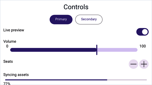
A Hydrolysis preview of WaterUI controls rendered from real bindings. Example source.
Button
Buttons are the most common interactive element. WaterUI buttons support multiple action patterns, custom labels, and visual styles.
Simple action
The simplest button takes a label and a closure with no arguments:
use waterui::prelude::*;

fn dismiss() -> impl View {
    button("Dismiss").action(|| {
        // Handle click.
    })
}
Reactive state via .state() and State<T>
Most real buttons need to mutate some reactive state — for example, increment a counter. The pattern is two-sided: pass the binding into the action through State<T> extractors, then attach the binding to the button’s environment with .state():
use waterui::prelude::*;

fn increment(counter: &Binding<i32>) -> impl View {
    button("Increment")
        .action(|State(count): State<Binding<i32>>| {
            count.set(count.get() + 1);
        })
        .state(counter)
}
Chain several .state() calls when an action needs more than one binding. They line up positionally with the State<T> parameters in the action closure:
use waterui::prelude::*;

fn reset(x: &Binding<i32>, y: &Binding<i32>) -> impl View {
    button("Reset")
        .action(|State(x): State<Binding<i32>>, State(y): State<Binding<i32>>| {
            x.set(0);
            y.set(0);
        })
        .state(x)
        .state(y)
}
Note:
.state()is aViewExtmethod that injects the value into the button’s local environment. Inside the action, theState<T>extractor pulls it back out by type and position. This avoids manualclone()dances at every call site and keeps the binding free of accidental capture.
Environment extraction
Any value already present in the environment can be extracted directly — no State wrapper needed. For example, the navigation controller is injected by NavigationStack:
use waterui::prelude::*;
use waterui::navigation::NavigationController;

fn back_button() -> impl View {
    button("Go Back").action(|nav: NavigationController| nav.pop())
}
You can mix State<T> parameters with environment extractors in the same action; the extraction order follows the parameter order.
Async actions
Use action_async when the handler needs to await something. The future is spawned on the local executor, so it can await network calls or file I/O:
use waterui::prelude::*;

async fn fetch_from_server() -> String { unimplemented!() }

fn fetch_button(result: &Binding<String>) -> impl View {
    button("Fetch Data")
        .action_async(|State(result): State<Binding<String>>| async move {
            let data = fetch_from_server().await;
            result.set(data);
        })
        .state(result)
}
Button styles
ButtonStyle controls visual emphasis. Choose the right style to communicate the importance of an action:
| Style | Description |
|---|---|
Automatic | Platform default (default) |
Plain | No background or border |
Link | Hyperlink appearance |
Borderless | No visible border, hover/press effects |
Bordered | Subtle border, for secondary actions |
BorderedProminent | Filled background, for primary actions |
Apply with .style() or convenience methods:
use waterui::prelude::*;

fn cta_row() -> impl View {
    hstack((
        button("Primary").bordered_prominent().action(|| {}),
        button("Secondary").bordered().action(|| {}),
        button("Subtle").plain().action(|| {}),
        button("Learn More").link().action(|| {}),
    ))
}
Tip: Use
bordered_prominentfor the main call-to-action on a screen, andborderedorplainfor secondary actions. This creates a clear visual hierarchy.
Custom labels
button(...) accepts any value that converts into a semantic Label, including raw strings. For richer content — an icon plus text, for instance — build a Label:
use waterui::prelude::*;
use waterui::icon::system_icon;

fn add_button() -> impl View {
    button(label("Add Item").icon(system_icon::plus())).action(|| {})
}
Buttons inside a Menu must use a semantic label or set accessibility_label, otherwise the menu cannot announce them to assistive technology.
Toggle
Toggle is a boolean switch backed by a Binding<bool>. It is the natural choice for any on/off setting — Wi-Fi, dark mode, or notification preferences:
use waterui::prelude::*;

fn settings(is_enabled: &Binding<bool>, dark_mode: &Binding<bool>) -> impl View {
    vstack((
        // With a label.
        toggle("Wi-Fi", is_enabled),
        // Without a label.
        Toggle::new(dark_mode),
    ))
}
Toggle styles
pub enum ToggleStyle {
    Automatic, // platform default
    Switch,    // sliding pill
    Checkbox,  // square with checkmark
}
Apply with .style():
use waterui::prelude::*;

fn dark_mode_switch(dark: &Binding<bool>) -> impl View {
    Toggle::new(dark)
        .label("Dark Mode")
        .style(ToggleStyle::Switch)
}
Layout behavior
With a label, Toggle expands horizontally to fill available space, placing the label on the leading edge and the switch on the trailing edge. Without a label, it is content-sized.
Slider
Slider lets users select a value from a continuous range by dragging a thumb. The constructor takes the binding directly; the range defaults to 0.0..=1.0 and is overridden with .range(...):
use waterui::prelude::*;

fn volume_slider(volume: &Binding<f64>) -> impl View {
    slider(volume).range(0.0..=100.0)
}
Labels
use waterui::prelude::*;

fn brightness_slider(brightness: &Binding<f64>) -> impl View {
    slider(brightness)
        .label("Brightness")
        .min_value_label("Dark")
        .max_value_label("Bright")
}
Layout behavior
Slider expands horizontally to fill available space but has a fixed height. In an hstack, it takes up all remaining width after other views are sized:
use waterui::prelude::*;

fn volume_row(volume: &Binding<f64>) -> impl View {
    hstack((
        text("Volume"),
        slider(volume).range(0.0..=100.0),
    ))
}
Stepper
Stepper provides +/- buttons for incrementing or decrementing an i32 value. Use it for precise, discrete adjustments — picking a quantity, setting a timer:
use waterui::prelude::*;

fn quantity_stepper(quantity: &Binding<i32>) -> impl View {
    stepper(quantity)
}
Configuration
use waterui::prelude::*;

fn item_stepper(count: &Binding<i32>) -> impl View {
    stepper(count)
        .label("Items")
        .range(1..=10)
        .step(1)
}
By default, the stepper displays the current value as its label. Use .label(...) to replace it with custom content, or .value_formatter(...) to customise how the value is rendered:
use waterui::prelude::*;

fn temperature_stepper(temperature: &Binding<i32>) -> impl View {
    stepper(temperature)
        .value_formatter(|v| format!("{v}°C"))
        .range(-20..=50)
        .step(5)
}
Layout behavior
With a label, Stepper expands horizontally. The label sits on the leading edge and the +/- buttons on the trailing edge, with flexible space between.
TextField
TextField is a single-line text input field backed by a Binding<Str>. You will use it for usernames, search queries, email addresses, and any short text input:
use waterui::prelude::*;

fn username_field(username: &Binding<Str>) -> impl View {
    vstack((
        // With a label.
        field("Username", username),
        // Without a label, with a placeholder prompt.
        TextField::new(username).prompt("Enter your name"),
    ))
}
Styled text binding
For rich text editing, bind to a StyledStr directly:
use waterui::prelude::*;
use waterui::text::styled::StyledStr;

fn rich_field(value: &Binding<StyledStr>) -> impl View {
    TextField::styled(value)
}
Multi-line input
TextField defaults to a single line. Set a higher line limit, or disable it entirely, for paragraph-style entry:
use waterui::prelude::*;

fn notes(notes: &Binding<Str>) -> impl View {
    TextField::new(notes).line_limit(5)
}

fn unbounded(notes: &Binding<Str>) -> impl View {
    TextField::new(notes).disable_line_limit()
}
Custom selection menu
.selection_menu(...) adds custom actions to the text selection context menu. It accepts any MenuView — most commonly a tuple of buttons or Menu instances:
use waterui::prelude::*;

fn field_with_menu(value: &Binding<Str>) -> impl View {
    TextField::new(value).selection_menu((
        button("Custom Action").action(|| {}),
    ))
}
Layout behavior
TextField expands horizontally to fill available space but has a fixed height. This makes it work naturally in forms and hstack layouts.
Menu
Menu displays a popup of commands when its label is tapped. The items argument is any MenuView — most commonly a tuple of Button, nested Menu, or Divider:
use waterui::prelude::*;

fn options_menu(selected: &Binding<String>) -> impl View {
    Menu::new(
        "Options",
        (
            button("Copy").action(|| {}),
            button("Paste")
                .action(|State(s): State<Binding<String>>| s.set("Pasted".into()))
                .state(selected),
            Divider,
            Menu::new(
                "More",
                (button("Reset").action(|| {}),),
            ),
        ),
    )
}
The first argument is the menu’s semantic label (any IntoLabel). Buttons inside a menu convert automatically into MenuItem::Commands.
Control summary
Here is a quick reference of the controls covered in this chapter and how they behave in layout:
| Control | Binding type | Stretch | Purpose |
|---|---|---|---|
Button | Action closure | None | Trigger actions |
Toggle | Binding<bool> | Horizontal | On/off switch |
Slider | Binding<f64> | Horizontal | Continuous range selection |
Stepper | Binding<i32> | Horizontal | Discrete value adjustment |
TextField | Binding<Str> / Binding<StyledStr> | Horizontal | Single-line text input |
Menu | Action closures | None | Popup of commands |
These controls are the building blocks, but what if you need to collect several pieces of data at once? In the next chapter, you will learn how WaterUI’s form system can automatically generate an entire editing UI from a Rust struct.